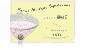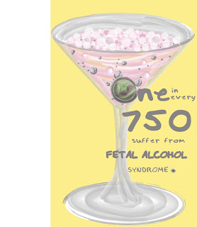
 This poster is the first of more variations to come :) It's somewhat predictable being that the martini glass is centered and the background is plain but it IS the updated version of the idea below. Hope this isn't too creepy for anyone :/ :)
This is a watercolor treatment I used from a Psdtuts tutorial. I am having trouble as to where I should place the text that reads "Don't be another statistic" I thought it worked well in the center because that is the focal point of the poster. This picture is kind of funny to me because my sister Brooke was my model and we didn't exactly have a pregnancy test on hand so we used a tampon and a monostat 7 box! I photoshopped the box and strip into the picture and it turned out pretty good! I am really into the idea of this poster and I want it to be perfect, so tell me what you think. :) Here is the link for the watercolor treatment I used: http://www.photoshopessentials.com/photo-effects/watercolor-painting/

ah! this is frustrating! I just wrote you a long comment and it dissapeared as I was trying to log in :( well, I'll write it again- I really like how you developed your idea from a rough sketch. I especially like how your image looks like a real painting and also how the olive is a part of the text. However, I think you could allow some more space around the borders, because right now it looks a bit crowded. Also, you could use some different colors for words like 'fetal alcohol' and the number to emphasize it more. Overall like the colors that you chose and I also think the typeface(whether you wrote it yourself..) goes well with the image. I hope this helps. Well done and can't wait to see your other ones too! :)
ReplyDelete