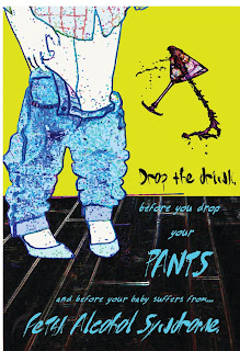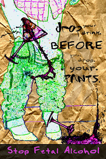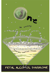

This poster needs some revising but this is what I have so far! I would have liked to of printed onto a recycled paper bag material but since the poster is so large I am just going to show you what that might look like by cropping similiar paper in :) I am not sure how I feel about the D being a part of the liquid and how well the type reads but I will work on it :)

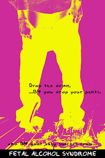
 This is my newest poster idea...I got my sister to pose for me :) This poster is aimed to appeal towards a younger generation (high school and college). I used the text abbreviation "B4" as opposed to "before". I am going to keep trying this idea out. My current thoughts are that the bottom line is hard to read...and is it necessary? Also, I want to try a different treatment because I think the shattered glass is hard to see. Lastly, I think I want to take another picture where my model's pants are dropping to her ankles.
i already told you i liked this one and gave my revisions for you but i think you should change your header...your not longer in type 2 lol
ReplyDelete