http://psd.tutsplus.com/tutorials/photo-effects-tutorials/create-an-illustrated-look-from-a-photograph/


 For the first time instead of thinking...thinking and more thinking for ideas, I just started drawing what I wanted to see for this Prism cover. The title needs tweeking but I am satisfied with the flowers and the layout. This cover option is working for me. Since Spring is approaching I have been inspired by flowers. As I look at photos and real flowers in nature, I am starting to see so much character and personality in them. I see flowers and blooms with the Prism cover because the Prism includes written pieces from a multitude of students here at Peace College. Being that a prism portrays the different perspectives of one object, I think flowers are appropriate being that their wonderful rich, bright colors and breeds can have so many different interpretations and meanings. More idea's to follow :)


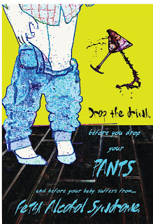
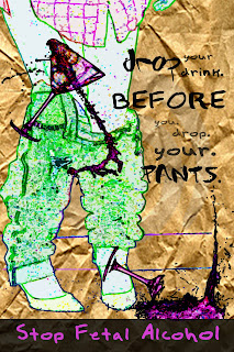
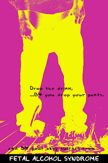
 This is my newest poster idea...I got my sister to pose for me :) This poster is aimed to appeal towards a younger generation (high school and college). I used the text abbreviation "B4" as opposed to "before". I am going to keep trying this idea out. My current thoughts are that the bottom line is hard to read...and is it necessary? Also, I want to try a different treatment because I think the shattered glass is hard to see. Lastly, I think I want to take another picture where my model's pants are dropping to her ankles.